Website Trends for 2014
We are only a couple weeks deep into 2014 and we are already into building dozens of shiny new websites so we thought it might be fun to review some trends we see for websites in 2014. All of which we plan to include in our new designs.
Now, some of these we did use in 2013, but at that time had no idea how much traction they were going to get, and how they have become a standard for brilliant web designs moving forward.
Web Fonts:
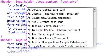
As designers we love experimenting with unique and different type fonts to better illustrate our clients brands and individualism. For years however most browsers were set to understand only select number of fonts, and therefore, designers only used those standard fonts. Today, through the use of CSS, and some other clever antics, we can use almost any font to make your site a lot of fun and better identify with your business.
For Example: www.johnmcnabb.com

Large HERO Areas
What the heck is a Hero Area? A term borrowed from the print industry, Hero Areas (the large banner at the top of a site used to advertise something significant) are becoming increasingly popular. They are a very effective way to command attention and draw visitors to a specific area of your website. In 2014 all of our websites will come standard with a manageable Hero Area so you can promote important messages and link them to a specific page within your website.
For Example: www.mckeeclean.ca
Videos To Replace Text
Why read about something when you can watch it? This is a big one you will start to see all over the web. Visitors are much more likely to allow themselves to be informed with greater volumes and a better understanding of your message when you provide it by way of an entertaining video in place of boring text (even if that text has a fun font, haha). Videos are fun to produce, provide great content for your site, and can be shared on a variety of social platforms. To meet the demand for this trend we have equipped ourselves with cutting edge videography equipment, complete with wireless microphones and green screening. Give us a call and lets get shooting!
For Example: www.smartmovesplayplace.com
Flat Designs
It is no secret that Apple has a huge impact on design influence, at least in North America, and when they decided to scrap its Skeumorphism and introduce a more flat design, consumers seemed to have some mixed feelings, but are settling into a position of comfort now and are liking what the see. We think many new websites moving forward will remove radical gradients, shadows and textures and will go for a more clean, smooth and flat design with JUST the right amount of graphical injection to give the site the perfect balance of modern elegance and interest.
For Example: www.barriemitsubishi.com
Creative Content Exploration
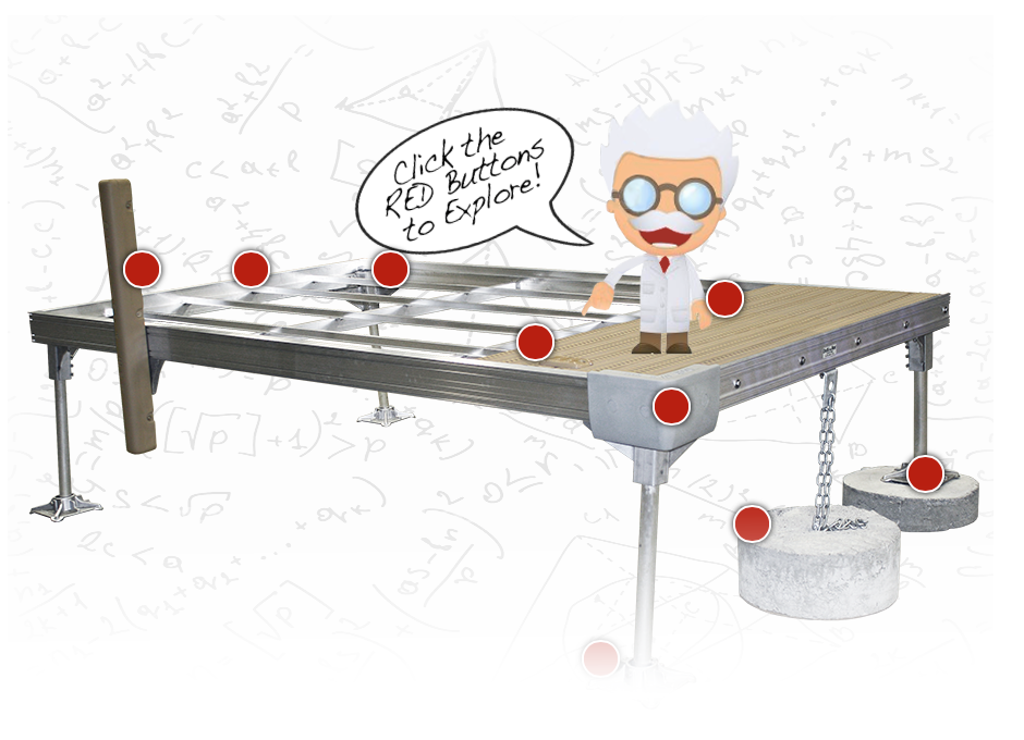
In 2010, we said goodbye to flash. In 2014, having flash on your website is like wearing a pair of old crocks; you know you shouldn't and you know what people think about it, but you just don’t like change. But there is one thing we did like about flash and we are starting to miss it. The fun and interactive exploration of content and it's back, through the use of HTML5! Sometimes you want your users to not just browse, but also EXPERIENCE your website, explore your copy and all the while be absorbing information about your product or service. Through HTML5 this can be achieved. Check out DockinaBox® for a great example of interactive explorations.

Back To News
