5 Key Considerations when buidling a Mobile Website
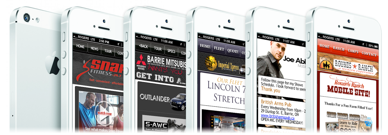
There’s no turning back now. The web has gone mobile and so has internet commerce. Studies show that mobile-based shopping and even purchasing is expected to increase by 200% by 2017. More users are accessing the web from more places and on more devices than ever before. Here are five crucial items that you need to consider at the outset of your mobile site design project.
1. Define Your Need for a Mobile Site
Usually, a mobile website design project comes about because you're developing a brand new website and it's economically beneficial to go mobile during the initial construction. If your current website analytics indicate that 20-30%, or more, traffic is from mobile users, or if you're a convenience-based business, and/or your users are expected to be an "on-the-go" browser, then a mobile site is what you're looking for.
2. Consider the Business Objectives
What are your objectives for the mobile version of your site as they relate to the full website? As with any design, you’ll need to prioritize these objectives, then communicate that hierarchy in your design. When translating your design to mobile, you’ll need to take this a step further and focus on just a couple of top priority objectives for the business.
3. Practice Responsive Web Design
With so many new mobile devices being released every year, the days of checking your site in a few web browsers and launching are over. It is necessary that we optimize your site for a vast landscape of desktop and mobile browsers, each bringing a different screen resolution, supported technologies, and user-base.
Utilizing the latest and most forward-thinking web technologies like HTML5, CSS3, and web fonts, you can design your site to scale and adapt to any device it’s viewed on. That’s what we call responsive web design.
4. Single-Column Layouts Usually Work Best
As you think about layout, a single-column structure tends to work best. Not only does this help with managing limited space on the smaller screen, it also helps you easily scale between different device resolutions and flipping between portrait and landscape mode.
5. Go from “Clickable” to “Tappable”
On mobile websites, interaction is done via finger taps, rather than mouse clicks. This creates a very different dynamic in terms of usability. When converting from desktop websites to mobile website design, you have to revisit your “Clickable” elements — links, buttons, menus, etc. — and make them "tappable.” While desktop websites lend themselves well to links with small and precise (clickable) areas, the mobile websites require larger active button areas that can be easily pressed with a thumb.
Back To News