 Ever wonder why so many websites are starting to look the same?
It might be a good thing..
Now designers can spend more time focusing on what really matters.
Open most websites made in the last couple of years and at first glance you will see a ton of similarities: big, bold headlines and images with rounded sans-serif fonts; minimal black and white interfaces with lots of negative space; little to no colour beyond the photography.
The modern interface style feels so bare-bones. Ironically, many of the most successful websites feel like they’re actually not designed at all.
What happened to the big dark-blue header? Where did the borders and drop shadows, bevels and textures go? Did the biggest brands forget about their branding? Or are they all just sharing the same templates?
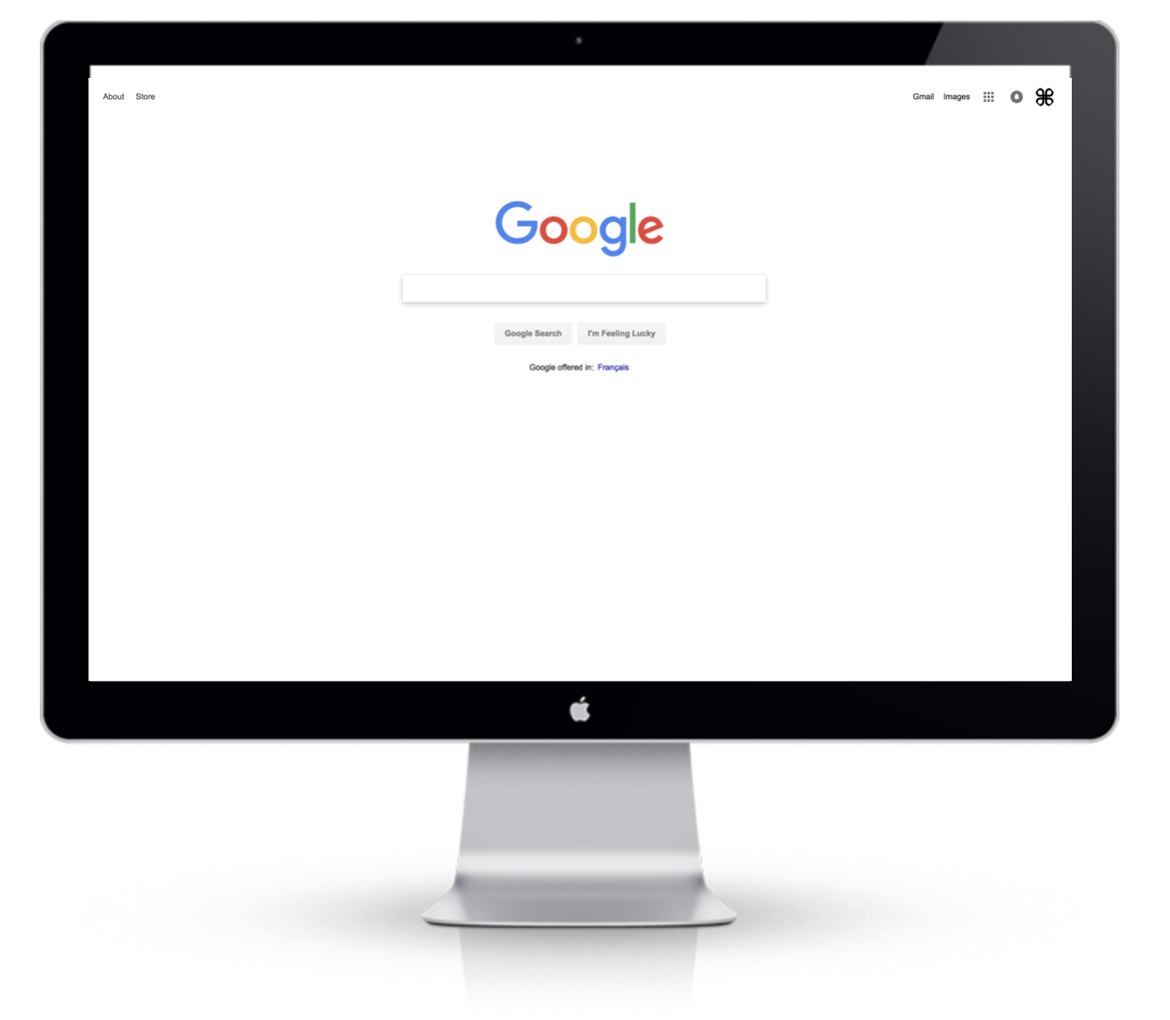
What’s more, there are clear signals that Google is also joining the colourless trend. This year, Google is pushing out a major revamp to its Material Design guidelines. And guess what? It looks exactly like everyone else. Most of its trademark red UI elements have completely vanished (like the red top bar) and we get a lot more white: a white bottom bar, white floating action buttons, white input fields and a white background.
We all know the web development community has a tendency to steal ideas from each other, but for the last decade (at least) design has always been the key to differentiation. This trend in design uniformity seems very counterintuitive.
So what is exactly is going on?
Well, I’d argue that the uniformity in web design is a good thing. And here’s a few reasons why.
More Focus On Content and Outcomes
Web fatigue is a real thing. Most people have grown tired of bouncing between too many websites or learning how to use a new interface after every new visit. Research shows that most people have just a few websites they use on a regular basis — sites that save time and make life easier. With uniformity across everyday digital products, designers can put more focus on doing exactly that.
As Don Norman — known for coining the term “UX” — said it best, “The real problem with the interface is that it is an interface. Interfaces get in the way. I don’t want to focus my energies on an interface. I want to focus on the job.”
More Consistency Means Better Usability
When was the last time you tried to buy something online and didn’t immediately scan the top right of your screen to get to your shopping cart? The standardized design conventions of nearly all e-commerce sites mean people don’t need to relearn how to shop at every online store.
Anything that is a convention on a majority of websites will be burned into most people’s brains and deviation, unfortunately, causes confusion and frustration. Designing something novel is risky, but consistent design (even among competitor websites) can reduce the likelihood of upsetting your users.
Branding Isn’t Just How It Looks, but How It Works
Reconciling a user’s needs and intentions with a solution is where great experiences are derived. A differentiated experience is intangible and arguably much more valuable to a brand than a differentiated look and feel.
Granted, style is important, and it can also play a big role in the experience. People are more tolerant and forgiving of a confusing interface when they find it visually appealing. A designer’s energy should be spent on creating the best possible way that someone can complete a task, not finessing colour palettes or dramatic animations. Designing something well, something valuable to the end-user, requires a seemingly infinite cycle of testing and iterating designs to get closer to what is useful and usable.
Barack Obama, Steve Jobs, Mark Zuckerberg; they’re all famous for wearing the same outfits everyday. The reason is what psychologists call decision fatigue. They have to make tons of decisions each day with a finite amount of energy, and limiting the minutiae of decisions like what to wear preserves the energy for the real stuff.
Designers should think about their energy the same way. With interface designs trending towards consolidation, designers can spend less time worrying about what colour or how big a button should be and more about why it should be there in the first place.
Sameness in Interface Design Does Not Stifle Creativity
Now, I know what you’re thinking — and yes, the downside is that you don’t want your website looking looking the same as others and that there will be less creativity and innovation. Which, honestly, I think is true. But even if every product designer joins the movement for stripped-down interfaces, there’s still plenty of meaningful design work to be done.
In fact, the truth is, sameness in design is beneficial for the near-term (hopefully I’ve made the case for why), but they have even greater implications for the long-term.
For one, the rise in augmented reality and artificial intelligence, our interactions with computers will likely become more invisible; screens are shrinking, gestures are becoming more familiar, and we’re talking or chatting with screenless interfaces now more than ever.
That said, there will be even more opportunity to consider engaging the senses (beyond visuals), attention, emotions or perceptions in new, creative ways. Limiting what we consider to be a good design to only what we see on a screen is, at a minimum, undermining the possibilities of what we might dream up for the future.
Back To News


.png)